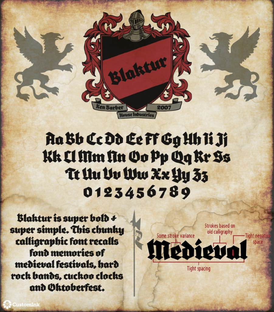
Font of the Week — Blaktur

This House Industries tough guy was created in 2007 by Ken Barber. Both bold and simple, this typeface calls back to the darker Medieval ages. It’s chunky lines can make it tough to decipher, but it also makes it the perfect choice for that heavy metal album art or Octoberfest celebration.
Our Font of the Week images are created by Emily Clark, an Expert Production Artist at CustomInk and a self-declared font addict. Font of the Week fuels Emily’s passion to research and learn more about beloved typefaces like Blaktur. What font should Emily feature next? Sound off in the comments below!

Leave a Comment