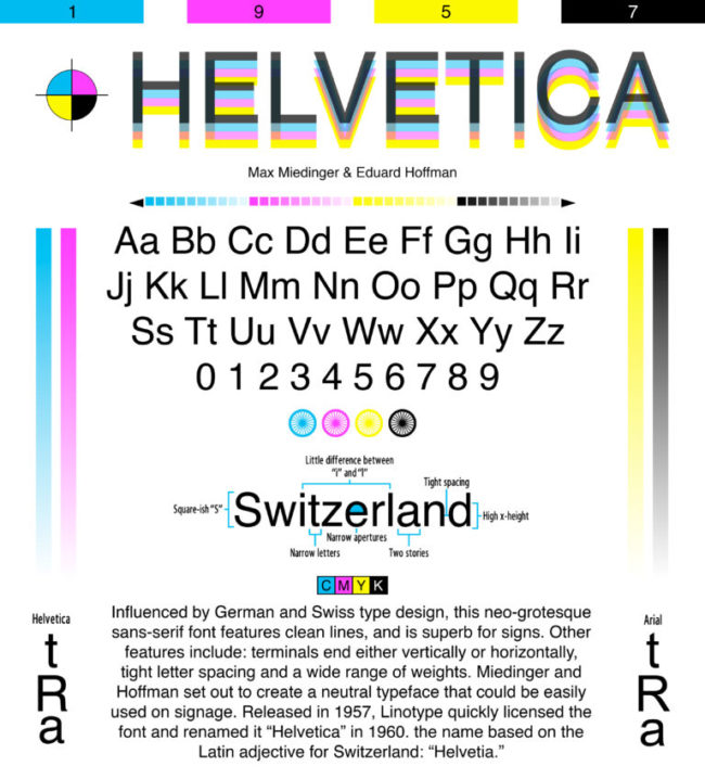
Font of the Week – Helvetica

With assistance form Eduard Hoffmann, Swiss typeface designer Max Miedinger created Helvetica in 1957. Its tight and narrow spacing is one of its most recognizable qualities, but limits its legibility onscreen and at small print sizes. Nevertheless, Helvetica is widely used in many company logos. For example, American Apparel, BMW, Nestlé, Skype, and Target all use versions of the font. Even the U.S. government uses widely uses the typeface—federal income tax forms are set in Helvetica.
Our Font of the Week images are created by Emily Clark, an Expert Production Artist at CustomInk and a self-declared font addict. Font of the Week fuels Emily’s passion to research and learn more about beloved typefaces like Helvetica. What font should Emily feature next? Sound off in the comments below!

Leave a Comment