Font of the Week — Din
 Posted By Lissa Eckert —
Lissa has been helping customers create their perfect custom swag at Custom Ink since 2014 and loves to share her insights, tips, and tricks.
SHARE:


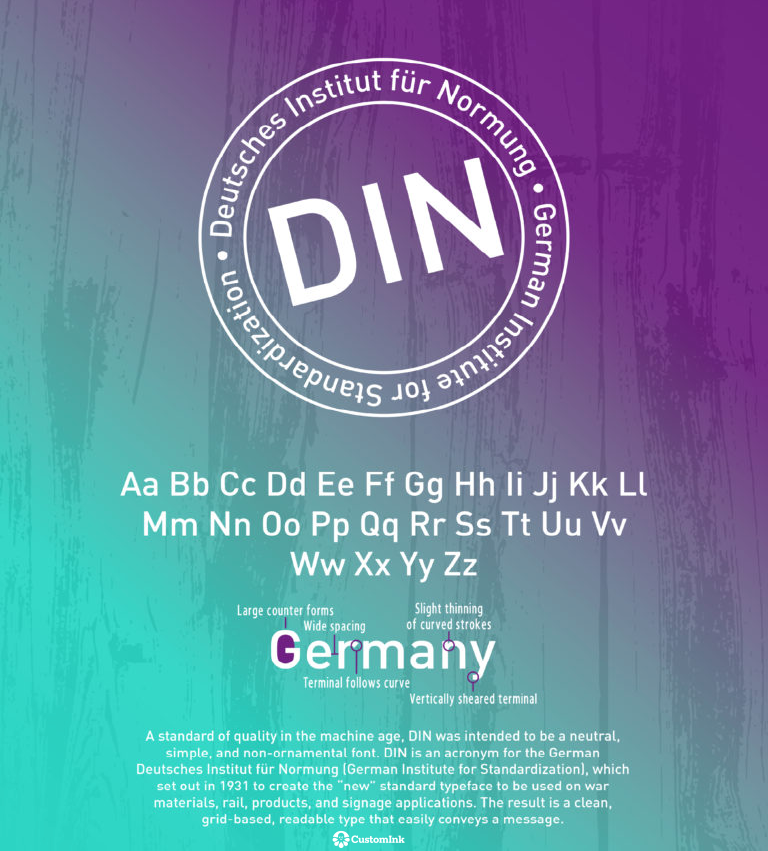
You may recognize Din and not even know it— it’s most popular for it’s use in traffic signs around the world. Created in Germany in 1931, Din actually stands for Deutsches Institut für Normung, or the German Institute for Standardization. Din’s clean, grid-based type was meant to convey simple messages quickly with it’s wide spacing and slight thinning on the curved strokes.
Our Font of the Week images are created by Emily Clark, an Expert Production Artist at CustomInk and a self-declared font addict. Font of the Week fuels Emily’s passion to research and learn more about beloved typefaces like Din. What font should Emily feature next? Sound off in the comments below!

Lissa has been helping customers create their perfect custom swag at Custom Ink since 2014 and loves to share her insights, tips, and tricks.