Fonts for Business Cards: Find the Best Font For You

Fonts for Business Cards: Find the Best Font For You
As a company that creates custom business cards, people always ask us, “What is the best font for business cards?” Well, there isn’t one simple answer to that question other than “It depends.” The font or fonts you choose for any of your business branding can be an opportunity to create an important impression. What impression do you want people to have? We’ve assembled lists of our top ten bold, standard, and playful fonts for business cards. We’ve also included answers to the top ten questions people ask about business card fonts below!

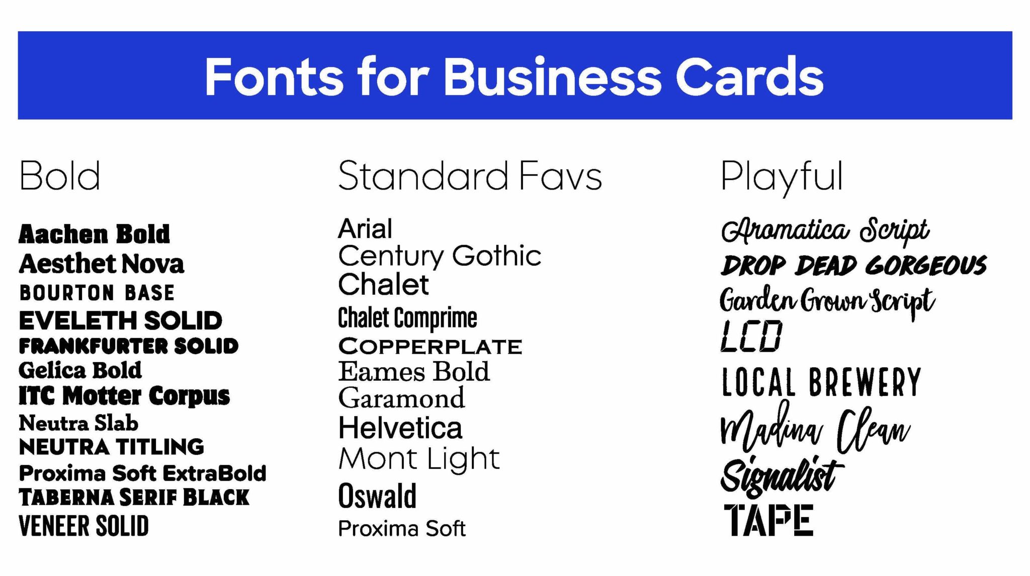
Bold Fonts
Is your business… all business? Do you want people to take you seriously? To trust that you know that you’re a leader and really what you’re doing? Then try a bold font like one listed below.
12 Best Bold Fonts for Business Cards
- Aachen Bold
- Aesthet Nova
- Bourton Base
- Eveleth Solid
- Frankfurter Solid
- Gelica Bold
- ITC Motter Corpus
- Neutra Slab
- Neutra Titling
- Proxima Soft ExtraBold
- Taberna Serif Black
- Veneer Solid
Standard Fonts
If your business persona is more subtle and classic, you might opt for a standard font. Straightforward and dependable, the standard fonts show that your customers can count on you.
11 Best Standard Fonts for Business Cards
- Arial
- Century Gothic
- Chalet
- Chalet Comprime
- Copperplate
- Eames Bold
- Garamond
- Helvetica
- Mont Light
- Oswald
- Proxima Soft
Playful Fonts
If your business is more about getting loose and having fun, then you might want to try a playful font. Fanciful and active, playful fonts show off your whimsical side and that you don’t take yourself too seriously.
8 Best Playful Fonts for Business Cards
- Aromatica Script
- Drop Dead Gorgeous
- Garden Grown Script
- LCD
- Local Brewery
- Madina Clean
- Signalist
- Tape
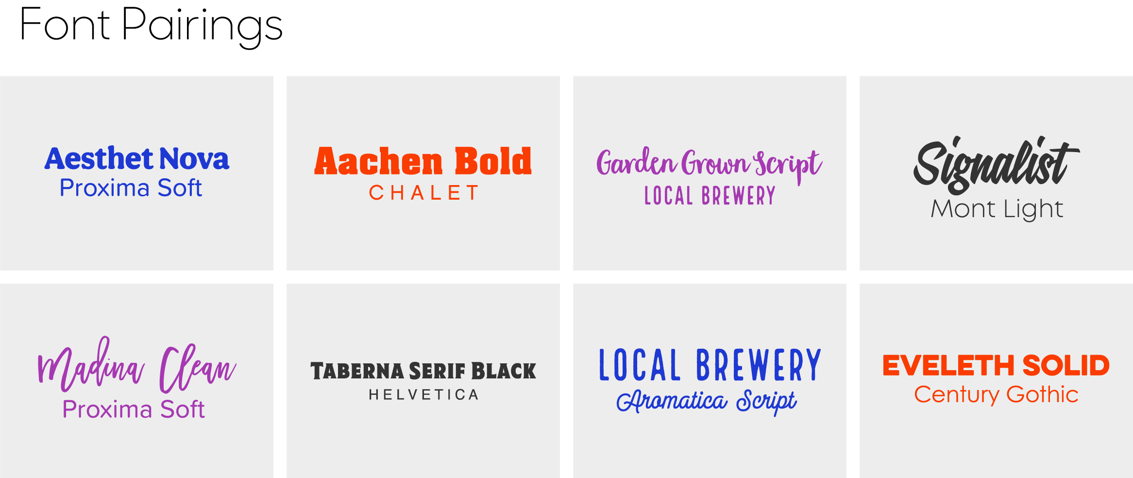
You can also experiment with mixing fonts to achieve an even more nuanced effect. We’ve put together some options so that you can see how it works, but really, the sky’s the limit.

Top Ten Questions People Ask About Business Card Fonts
- What font is best for business cards?
It really depends on your business and your taste. Think about how you want to come across and what impression you want people to have of your brand and then look for a font that conveys that. - What font is most attractive to customers?
The most attractive font is one that looks nice but is also functional. It’s important to make sure that your font is clear and readable, especially at a smaller point size, because if they can’t read what it says then it doesn’t matter how pretty it is. - What is a good font for a card?
You can never go wrong with a classic font like Arial or Helvetica, a bold font like Neutra Slab or Bourton Base, or a playful one like Drop Dead Gorgeous or Local Brewery. - What is the most professional font for business?
Arial or Helvetica are two of the most popular and standard fonts around. - What font size should business cards be?
Your font size should be 7 or 8pt at the minimum. You can play with sizes to see what looks and fits best depending on what information you want to include. - Is font size 10 too small?
Font size 10 is definitely not too small! You could even go a little smaller, just try not to go smaller than 7pt. - What font attracts buyers?
It depends on what you’re selling! Think like your customer and what you feel like would entice them to buy what you have to offer. You can’t go wrong with any of the fonts we’ve featured. - What is a good font for business logo?
The best way to choose a font for a business logo is to think about the whole design. Do you want it to be clean, modern, retro, or flowery? Think about the shape and the colors you want to use and let that inform your decision. A few suggestions: clean – Century Gothic, modern – Eames Bold, retro – LCD, flowery – Madina Clean. You can also search font descriptions in our Design Lab. - How do I choose a font for my business?
Think about how you want your business to look and feel, and how you want people to interact with it. Make a list of terms that go along with this, and then search for fonts with those terms. - What font is most pleasing to the eye?
It’s your eye, you tell us! Every eye sees something different, so trust your taste and have fun with it!
So, there you have it. Think about what you want people to think and feel when they see your business card, try some options, show some people you trust, and then go order some new business cards!


