Font of the Week — Americana

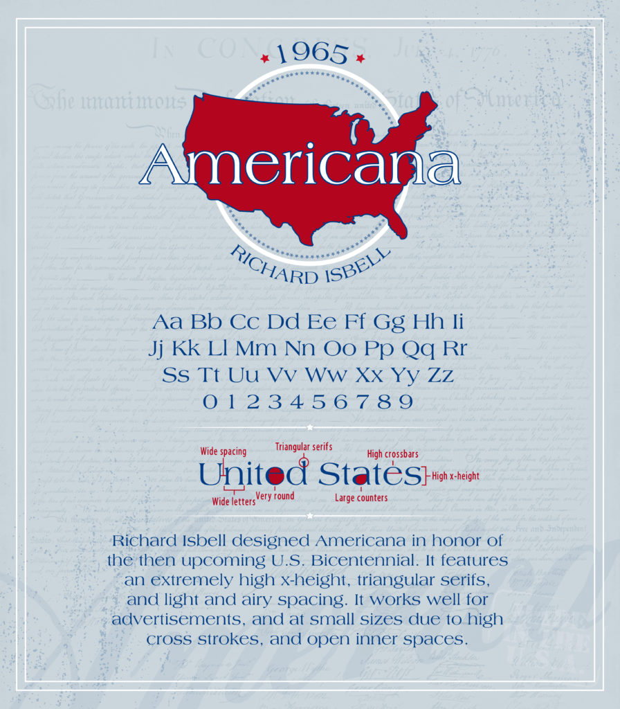
Americana was designed by Richard Isbell in 1965 to honor our country’s upcoming bicentennial. With extremely high x-heights, triangular serifs, and airy spacing, Americana is perfect for advertising. Isbell’s creation of such a versatile typeface means Americana works great for not only large print needs, but small as well.
Our Font of the Week images are created by Emily Clark, an Expert Production Artist at CustomInk and a self-declared font addict. Font of the Week fuels Emily’s passion to research and learn more about beloved typefaces like Americana. What font should Emily feature next? Sound off in the comments below!


