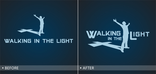
Before and After: Christian
So, I was looking through the orders today for Christian groups, hoping to get some ideas for new design templates. I came across several shirts that would benefit from a few quick changes to make the design look more unique. Often people used a line of text and a clipart, but would benefit from a quick lesson in thoughtful placement. You can make your design look more designer-y in under 2 minutes with just a few simple changes. Above is a before and after of one Christian design and below is a video of how I made the changes. Simply re-arranging the text makes the clipart feel more connected to the words. Plus now he really looks like he is reaching for the “light.”


Nice update to that design. I liked the idea of the silhouette’s shadow being a cross so I clicked the link to see who had created it and saw this post.
Hi..what type of font you use on this design?
Leave a Comment