
Custom T-shirts Color Combination Guide
What colors say about you
How many times have you been asked “what’s your favorite color?” For some, it’s a tried and true lifetime favorite, like blue. For others, it’s a hard choice between a classic or a trendy hue like millennial pink. No matter your favorite, choosing a color is personal and says a lot about who you are or what you’re creating. That’s why we offer so many great colors and shades for our custom t-shirts so that you can design something uniquely you. Below, we share some of our favorites in our custom t-shirts color combination guide.
Two color blends
Monochromatic
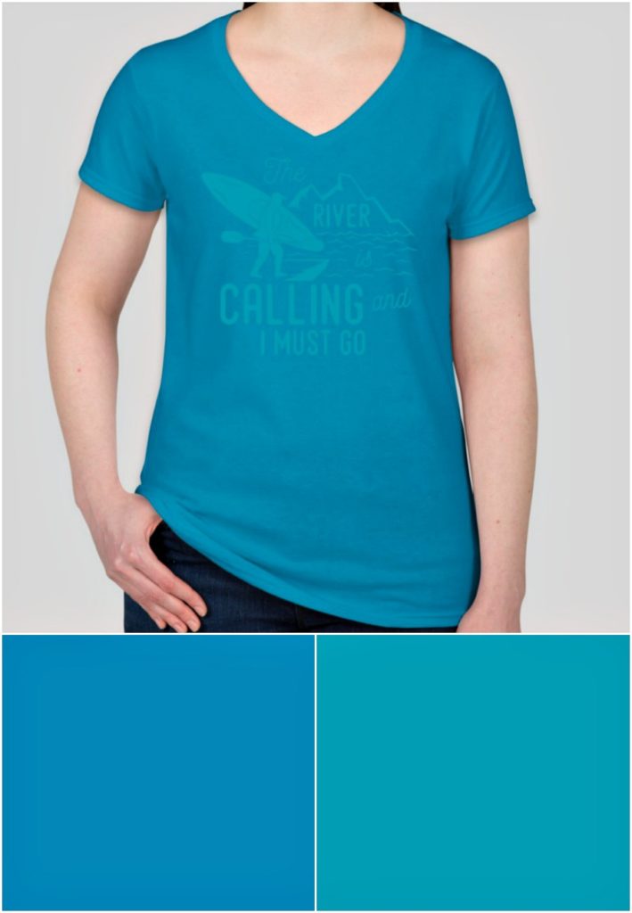
An easy but effective way to make your design shine is with a monochromatic shirt. It’s a subtle, subdued look that’s also trendy despite its downplayed and almost mysterious style. We love this combination of turquoise and sapphire and how calming it is. The colors go together perfectly and also let the design be seen just enough to keep the look clean. You can achieve this two tone look by using any colors of similar nature, like these two, or red and orange, purple and blue–you get the picture.
Negative space
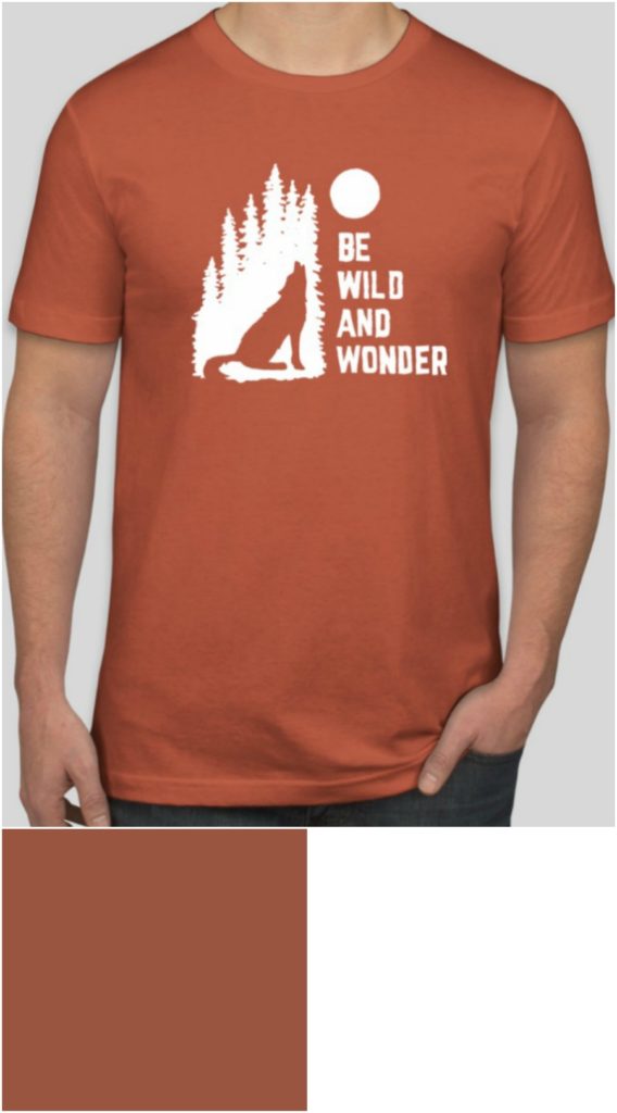
Sometimes creating a color combination that really pops only takes one color. Using negative space, or white ink, is a clean way to make your design stand out on a colored t-shirt. Just pick your favorite base color, which in this photo is “rust,” and add your logo, sayings, or image in white. If you have a design or like one of our designs in the Design Lab that has color, you can click the “make one color” button. This will turn the whole graphic to white (or any other color you might want). This is a great design trend for anyone, but we could see it being particularly great for businesses or events where there’s more than one color to use. If your restaurant’s colors are blue, green, and yellow, you can customize the same shirt in all three colors with the white ink design. That way it shakes up your look but keeps the t-shirts classic and not too busy.
Three color blends
Olive you, color
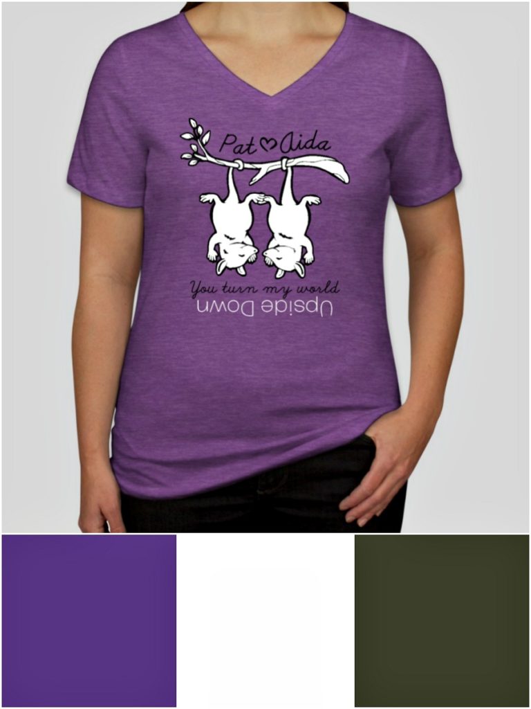
Using three colors on your t-shirts–1 shirt color and 2 ink colors–will really give it an added dimension. This design is a great example of how using more color can take a design to the next level without being too busy. We love the use of white and and olive for an understated look on the bright purple tee. Using olive instead of black is a nice trick for having a color that can outline, but also feels a little more thoughtful and artsy than classic black. You could also try this on other bright color tees by swapping out the white and olive for similar colors–like yellow and navy or pink and maroon.
Four color blends
Youthful & airy
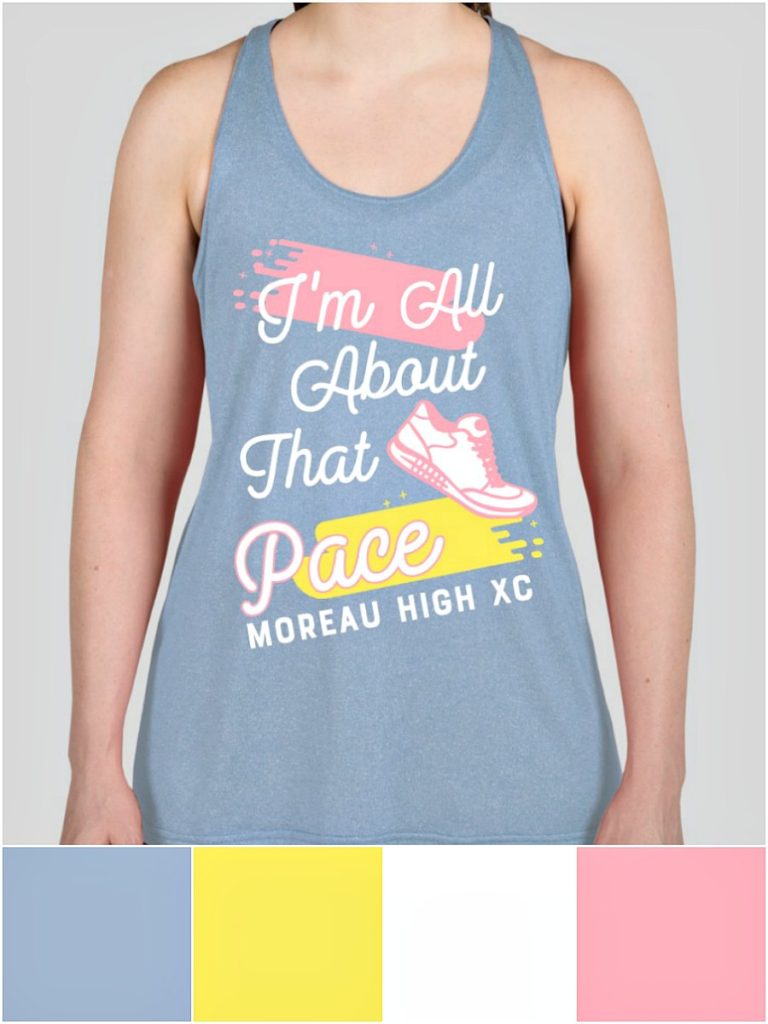
Now we’re getting serious with our color combos, and mixing it up with four colors. We love the light and vibrant look of this design. It has a columbia blue base with lemon, pink, and white accents. It’s springy, youthful, fresh, and would be perfect for your yoga studio, team, or spring event. When you’re using this many colors you can use them in interesting ways–such as outlining “pace” in pink to make the word really stand out.
Five color blends
Vibrant contrast
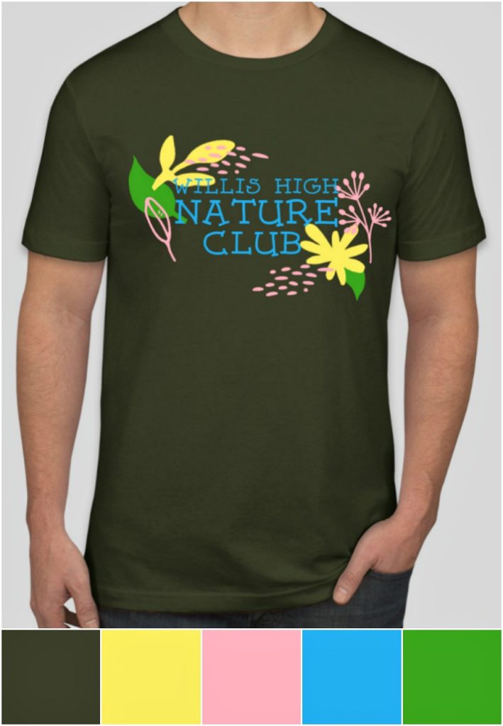
If you love contrast, you’ll love this color combination. It has an olive base with pink, green, and lemon accents. You probably wouldn’t think to put these bright colors on an olive green, but it totally works, doesn’t it? Using a dark olive green tee is a great alternative to a dark gray or even navy shirt if you want something a little different. It’s also perfect for this t-shirt to bring a green earthiness into these nature club tees. The punchy contrast against the dark t-shirt dramatizes the design, while the accents still manage to keep it fresh and fun.
90s throwback
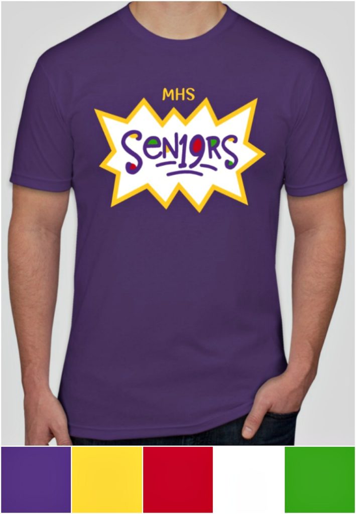
This tee gives us all the 90s feels. It’s like Saturday morning cartoons wrapped up in a t-shirt. We love this purple rush base with accents of gold, red, green, purple rush, and white. We’re pretty sure the Rugrats would totally wear one of these. If you’re using a lot of bold colors in your design, creating a white “frame” is a great way to put them on display by making the shape “pop” as a backdrop for text. It makes it feel like the “seniors” in the design is actually the color coming through from the t-shirt, giving it a high-end look.
Six color blends
Smörgåsbord
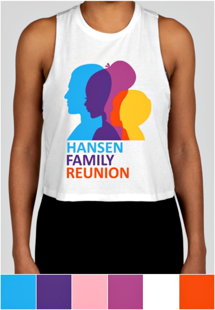
Can’t pick just a couple of colors? Then use them all! You can’t go wrong with a white t-shirt as the background for a colorful design like this one, which uses sky blue, purple, magenta, orange, and pink. This stunning graphic is perfect for your family reunion or any family-focused business. We love how the colors “bleed” into one another to elevate the look. And when you’re using lots of colors in your graphics, use those same colors for your copy to bring it all together.
There’s so many color combinations to choose from, we encourage you to visit our Design Lab and play around to see what works for you. While this list includes some of our favorites, you can edit any of these designs and swap out certain colors or add another. Tell us about your favorite color or colors in the comments below!
Looking for more great color combinations? Check out our Best Colors for Eye-Catching Custom Banners post.

Kate wants her work to impact the little but important moments in people’s lives—like birthdays, anniversaries, and family celebrations. She loves coming up with witty copy that might inspire someone to create an awesome t-shirt!
Leave a Comment