
Typographer of the Month – Ben Kiel
 At CustomInk we love custom designs, and a lot of times that includes fonts! What you might not know is that fonts, or typefaces, are created by typographers and are an art form in their own right. We’ve chosen some of our favorite fonts to feature here on our blog.
To help you understand them a little bit better, we’re doing Q&As with their creators. Here we meet Ben Kiel, the typographer behind Girard Slab. Ben runs Typefounding, a typeface design and production studio in Saint Louis, Missouri.
CustomInk: What made you want to become a typographer?
Ben Kiel: I fell into typeface design by way of letterpress printing. In my undergraduate program we had access to a book studio/letterpress shop. After discovering it, I spent all the time I could there. It sparked my interest in letterform and type, and from that I eventually wound up as a typeface designer. My path went from a graphic designer who worked primarily with type to a master’s education in typeface design at the University of Reading, to House Industries.
CustomInk: What’s your first step in creating a new font?
Ben Kiel: The first step is to clearly define what a new font is to do. You have to figure out why you are going to make something—either for an aesthetic reason or a practical concern, before you start creating. Having a use in mind allows you to both research and design form in a directed way; one has a question/yardstick to measure the work by.
CustomInk: How long does it take you to create a font?
Ben Kiel: This is a hard question to answer, as it really depends on the typeface design. Some things can take a little as a couple of weeks to a month, some things sit and percolate and grow over the span of years.
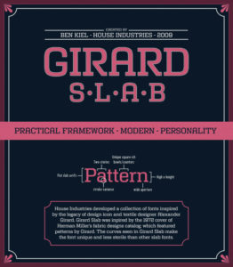
CustomInk: How long did Girard Slab in particular take you to create?
Ben Kiel: Girard Slab evolved over the period of about 2 years or so. It was not the only thing I was working on in those years, but from the start of the project to the end, that was about the length of time.
CustomInk: How has your style developed or changed since Girard Slab?
Ben Kiel: I don’t know if my style has changed, but my eye for detail has grown. I find that the curse of design is that when you go back to older projects and work—if you are learning and growing—you only see everything that you couldn’t see at that point in your career. This could be looked at in a discouraging light, but I find it to be encouraging; no matter where you are, there is always the opportunity to learn and grow.
CustomInk: What is your favorite font that you’ve ever created?
Ben Kiel: One of the things that I’m most proud of was my work for Commercial Type in helping them to produce Dala Prisma. The project was a lot of work, but it is so delightful to see it in the world being used, and it lead to some fun formal solutions.
CustomInk: What’s your favorite font that was created by someone else?
Ben Kiel: The work of Bram de Does—Trinity and Lexicon—are two of the designs that never cease to amaze me as a typeface designer. They are so fit for their purpose, but also as forms so beautiful. Currently, I’m enjoying what James Edmondson at Oh No Type Co. is doing, Hobeaux Rococeaux in particular.
CustomInk: How has the digital world changed how fonts are created for you?
Ben Kiel: The main change in the last couple of years has been in the use and design of typefaces for screens. There’s a lot of really exciting work being done with font formats and the way that type can respond to the context of the screen that I think will be very interesting in the next couple of years. Though type has been digital for a long time, it is reaching a point where instead of being a fixed image for the printed page, it can interact and change for the context of the screen. That’s exciting.
CustomInk: What’s something you think people should know about fonts?
Ben Kiel: Two things: Fonts are mostly made by small companies of one to two people, so if you have a question about a font, you’ll likely be emailing the person who made it—it’s a very nice direct connection. The other thing is that while fonts are sold by licensing (like buying software), they are one of the few pieces of software that will last. The first fonts I bought were Mrs. Eaves and Triplex Condensed Black from Emigre in 1996. Those fonts still work on my computer. Fonts are amazing in that way, they keep going and going.
CustomInk: What is your froyo topping of choice?
Ben Kiel: Gummy bears.

Kate wants her work to impact the little but important moments in people’s lives—like birthdays, anniversaries, and family celebrations. She loves coming up with witty copy that might inspire someone to create an awesome t-shirt!
Leave a Comment