Typographer of the Month—Ken Barber
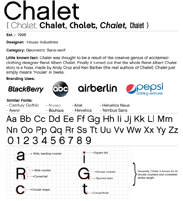
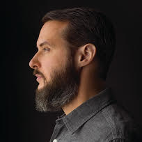


To help you understand them a little bit better, we’re doing Q&As with their creators. Here we meet Ken Barber of House Industries, the typographer behind Chalet.
CustomInk: What made you want to become a typographer?
Ken Barber: I developed an interest in lettering and illustration when I was young, but I don’t think I knew what type design was until I attended college. That’s when I began integrating hand-lettering in my course projects at Tyler School of Art. After I met the guys from House Industries, I tried adapting those hand-drawn letterforms to work as fonts. I had no formal type design training, so I learned by studying specimen books, stalking designers, and making plenty of mistakes.
CustomInk: What’s your first step in creating a new font?
Ken Barber: Generally speaking, typefaces should begin with a purpose in mind: whether it’s tailoring a font to suit a particular application, or simply exploring a direction to satisfy individual curiosity. This motivation is essential for guiding the design process. House Industries’ typefaces usually start with some selfish motive—it could be to create a font for an internal project or just to see how far we can take an idea. We also try to determine how a prospective typeface will fit within the House font library, while considering potential commercial appeal.
CustomInk: How long does it take you to create a font?
Ken Barber: I’m sure my colleagues at House would say, “too long”—probably because it’s not uncommon for me to get distracted by other jobs in the studio. That being said, side projects provide me with a welcome breather from the tedium of font development. This makes it hard to estimate the length of the type design process. A single font can take as little as a few weeks to create, but it can be years until a complex typeface family in a range of weights and styles sees the light of day.
CustomInk: How long did Chalet in particular take you to create?
Ken Barber: Chalet was released nearly 20 years ago, so my memory is a little foggy. If I recall, the original family of 10 fonts took the better part of a year to complete. After I drew the different characters sets for the various styles, House co-founder Rich Roat handled the nuts and bolts of production.
CustomInk: How has your style developed/changed since Chalet?
Ken Barber: I think of style as a designer’s overall approach, which extends beyond aesthetic inclinations or transient interests. Chalet began as a tongue-in-cheek commentary on typography of the late 1990s, when sans serifs like Helvetica and Futura were central to the “dumb modernism” trend. While inspiration for my typefaces may change, I try to maintain a similar degree of quality in every project when it comes to research and production. I’m the same smart ass that I’ve always been, but over the years I’ve learned a thing or two and (hopefully) matured in my abilities.
CustomInk: What is your favorite font that you’ve ever created?
Ken Barber: There are things that I like about each font that I’ve created, and there are things I wish I had done differently. That’s not unusual considering that a designer’s tastes and talents evolve, but it does make it hard for me to choose a favorite. Push come to shove I’d pick Studio Lettering, a collection of three script fonts informed by mid-20th century advertising that also has some nifty OpenType features thanks to programming by Tal Leming.
CustomInk: What’s your favorite font that was created by someone else?
Ken Barber: People are often surprised, even incredulous, by my response to this question: one of my all-time favorites is Mistral by Roger Excoffon. Producing such a seamlessly flowing script typeface —in metal type, no less!— is an impressive feat.
CustomInk: How has the digital world changed how fonts are created for you?
Ken Barber: With further growing typographic needs—like responsive typography on the web, for example—font designers are facing different demands as well as new possibilities. Fortunately, there are also more typeface designers creating their own tools to face such challenges.
CustomInk: What’s something you think people should know about fonts?
Ken Barber: If readers have gotten this far, hopefully they’re beginning to realize just how much time and effort goes into creating typefaces. Most are produced by small studios that make their bread and butter by designing fonts. With that in mind, I encourage graphic designers to support the creation of new typefaces by properly licensing their fonts.
CustomInk: Custom Ink has a froyo machine in the office. What is your froyo topping of choice?
Ken Barber: Peanut butter cups.
CustomInk: If you had to wear one piece of clothing for the rest of your life, what would it be?
Ken Barber: A black Gildan Ultra Cotton short-sleeved t-shirt.

Leave a Comment