
Typographer of the Month — Joe Prince
 At CustomInk we love custom designs, and a lot of times that includes fonts! What you might not know is that fonts, or typefaces, are created by typographers and are an art form in their own right. We’ve chosen some of our favorite fonts to feature here on our blog.
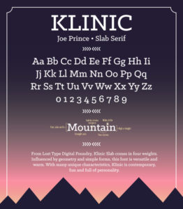
To help you understand them a little bit better, we’re doing Q&As with their creators. Here we meet Joe Prince, the typographer behind Klinic Slab. Joe is a graphic designer that specializes in logo and typography design based in Los Angeles.
CustomInk: What made you want to become a typographer?
Joe Prince: How I got started is sort of an ironic story—one might say it’s funny. About 9 years ago, I got caught up in some bad drugs while I was in high school. I was 16 at the time and started hanging out with the wrong crowd, going to parties every weekend and getting into mischief. The drug usage got really heavy and the caliber of drugs I started experimenting with was really bad. My black-and-white personality contributed nothing but trouble to this lifestyle, because once I started, it was hard to stop me.
Long story short, this went on for a few years and before I was 18, my parents sent me to rehab. I was there for a few months, was supposed to find a “higher power,” and was on my way—the last time I used drugs was December 24, 2007, so my official clean day is Christmas Day of 2007. While I was in rehab, I needed something to do to occupy my time and take my mind off the drugs, so I started sketching designs (shirts, logos, etc.) just for fun. After I was back home from rehab, I continued sketching and have never looked back since.
CustomInk: What’s your first step in creating a new font?
Joe Prince: Starting a new font is always the most fun aspect of the project in my opinion. I think this is largely due to the fact that you have complete freedom and flexibility to control the look, feel, and overall tone of the typeface. This is the part of the project that is crucial in laying down the foundation, and making preliminary decisions that could potentially affect the entire look of the face. At this point in the project it is typically known which category of typefaces it is going to belong to (i.e., sans-serif, serif, slab serif, script, etc.). It is also known what the design intent is for the final product, such as standalone user or application-specific integration.
The real fun begins when it comes time to begin sketching the first letter, or first few letters. I usually start with the letter “h.” The letter “h” tells you a lot about the particular face: whether the face has slabs/spurs, what its contrast is (based on the amount of “pinch” the letter has), the overall width, whether or not the contours are abrupt or more transitional and flowing in nature, what the x-height and ascender-height is for the entire face, etc. I usually spend a lot of time on this letter at the forefront of the project as it is the reference and driver for everything else to follow.
CustomInk: How long does it take you to create a font?
Joe Prince: The time it takes to develop a font typically is not that long, but the time it takes to create an entire typeface (5 weights with matching italics for example) can take quite some time. It can be on the order of magnitude from 2 to 4 months, all the way up to a year and a half. The part of the process that takes the most time is creating the extrema weights (i.e., the thin/hairline and bold/heavy), as well as a middle weight that is typically necessary for a more controlled interpolation process. So for a typeface containing 5 weights with matching italics (a 10 font family), a total of 6 unique fonts need to be drawn from scratch, with the other 4 generated from interpolation.
CustomInk: How long did Klinic Slab in particular take you to create?
Joe Prince: Klinic Slab was a project that I decided to undertake in the beginning of 2012, shortly after completing an ultrabold sans-serif typeface (Bemio). At this time, I was still an up-and-coming typographer (which I still very much am today) and wanted to experiment with creating a complete typeface full of OpenType (OT) features such as small caps, stylistic alternatives, true italics, and so on. As I was trying to learn as much as possible about the process, I didn’t want to center the project on a sans-serif typeface largely due to their inherent simplified forms. But I also didn’t feel ready to conquer the daunting task of a full-serif typeface either, and hence, I found a perfect blend of the two—a slab serif typeface.
After many, many rounds of revisions, refinements, and fine-tuning, I had finally finished the typeface and was content with its look. Because I was still a college student at the time of production of Klinic Slab (studying mechanical engineering), it took over a year to complete the entire typeface.
CustomInk: How has your style developed/changed since Klinic Slab?
Joe Prince: I wouldn’t necessarily say my style has changed since designing Klinic Slab, but it most certainly has developed. I have gained a better fundamental understanding of the letterforms themselves, and the core components/attributes that make fonts and typefaces different from one another. I think a style is something that is developed, and progresses with time, but I think a style is not something that can really be learned; it is something that comes naturally with experience.
CustomInk: What is your favorite font that you’ve ever created?
Joe Prince: My favorite font of mine is Bemio. I have always been drawn to heavy, bold sans for some reason. There is something about that style that just has so much personality. I think it’s somewhat warm and inviting, and can lend itself to many different implementations. Bemio also has quite a vast character and OT set, which I’ve always found a lot of fun to play with. After all, who doesn’t love a “U dieresis acute small cap!?”
CustomInk: What’s your favorite font that was created by someone else?
Joe Prince: My favorite font of all time is Helvetica. Hands down one of the most beautiful, and long-lasting fonts of all time. If I could design a typeface half as good as Helvetica in my lifetime, I would consider myself very lucky.
CustomInk: How has the digital world changed how fonts are created for you?
Joe Prince: Technology is a beautiful thing, and understanding its potential and being able to utilize it is key in streamlining a process, such as that for making a typeface. There are many monotonous, yet crucial, processes that need to take place during the development of a typeface. These may include spacing/kerning/tracking each individual font (a daunting process if done manually), hinting each individual font (for on-screen use) at a wide range of point sizes (an even more daunting task if done manually), amongst many other things.
Recently I have been using the iKern service to space/kern my typefaces. iKern is an algorithm that an Italian gentleman (Igino Marini) wrote several years back. In short, it calculates the amount of “occupied” space a character contains in relation to another paired character, and determines an optimal amount of space to distance the two characters in a way that is optically balanced. Being algorithmic, it is naturally very quick to perform, usually resulting in getting a fully-spaced/kerned font back in a matter of a few days. Compared to the manual process, this can be expedited ten-fold and will more than likely have more consistent results.
CustomInk: What’s something you think people should know about fonts?
Joe Prince: I don’t think there’s anything people should know about fonts, that’s the beauty of them. Fonts and letters are something that are always there, but the person or audience doesn’t have to know why or how it got there. A font speaks to each person differently, and that is what makes designing fonts so much fun. You never know how it’s going to speak to someone, and how it may affect them.
CustomInk: What is your froyo topping of choice?
Joe Prince: I love froyo, but the toppings are just too expensive! What I typically do is get cookies and cream, and then go home and put some Cinnamon Toast Crunch into a ZipLoc bag and smash it into pieces with a can. Then I sprinkle that on my froyo. It’s a win-win!
CustomInk: If you had to wear one piece of clothing for the rest of your life, what would it be?
Joe Prince: I would definitely wear a belt, because it gives you somewhere to put your hands when you’re naked. Seinfeld anyone? 😉

Kate wants her work to impact the little but important moments in people’s lives—like birthdays, anniversaries, and family celebrations. She loves coming up with witty copy that might inspire someone to create an awesome t-shirt!
Hi Kate, I wondering when this post was written. I tried to track down Joe Prince on the internet but looks like all online traces of him end in 2015. Your interview seems to be the most recent. Anyway it’s not a huge deal. I just wanted to thank him for his beautiful Questrial font – esp for making it available on Google Fonts.
Bao
Leave a Comment